Protection Analytics
- In this section, you can explore analytics related to authorized and unauthorized protection activities.
- You can click on components of the different charts and create filters to view data in a particular context.
- These charts will help you keep track of how protected files/emails are being used and identify anomalies.
Step-by-step
![]()
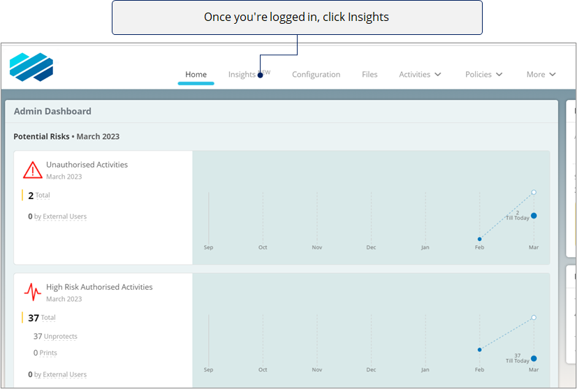
![]()
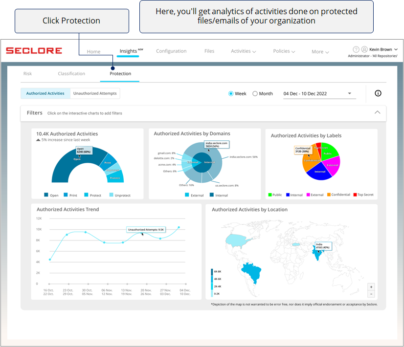
You can either go through Authorized Activities or Unauthorized Activities. Click on the type of activities you wish to analyze.
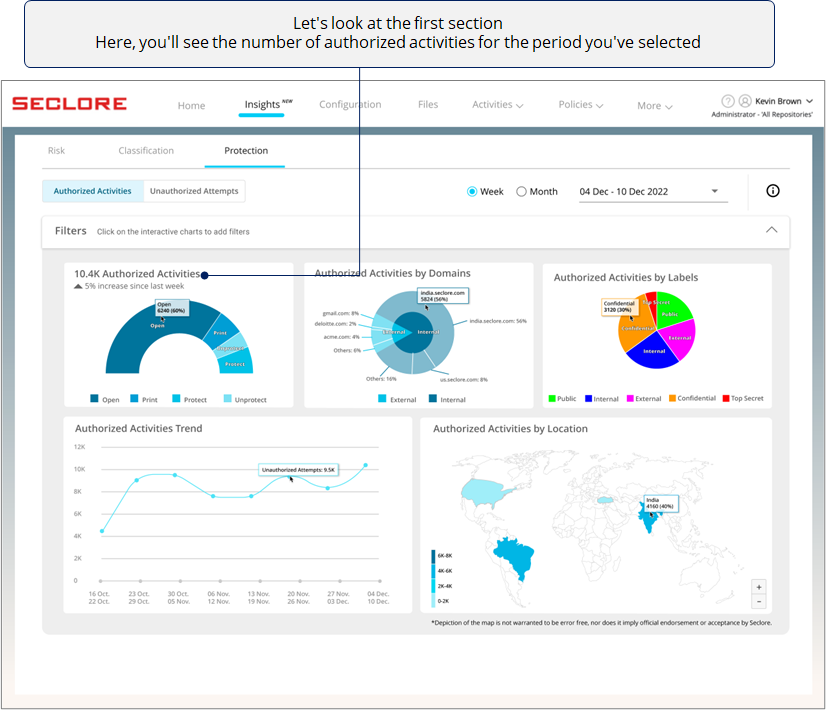
In the Authorized Activities section, you'll get useful charts and graphs related to Open, Print, Protect, and Unprotect activities performed by authorized users on protected files/emails.

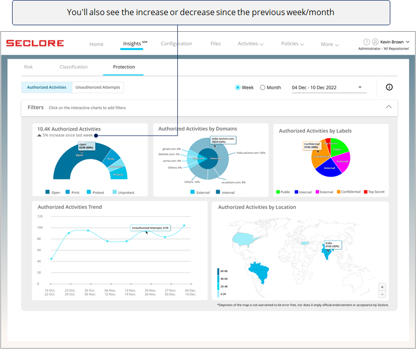
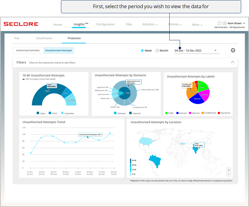
*Note that selecting 'Last Week' would show data from Sunday to Monday in the previous week.
![]()
![]()
![]()

This data will help you understand how well Seclore's IRM capabilities are being used in your organization.
![]()
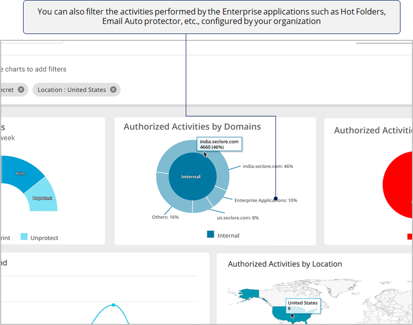
The next chart helps you understand which domains are performing most of the authorized activities.
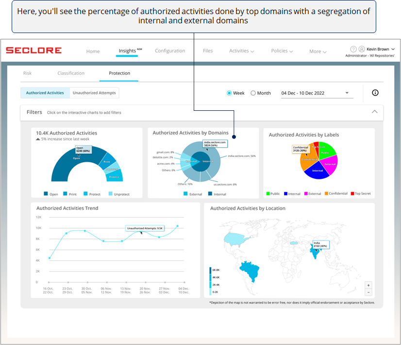
If you see too many activities done by one external domain, it could prompt you check whether there was a valid business need for it. Similarly, you can use this chart to identify other anomalies.
*Domain used by users from your organization are considered internal domain, whereas any other domain is considered external.
![]()
Next, there's a pie chart with slices that represent the percentage of authorized activities done on classified files/emails with different classification labels.
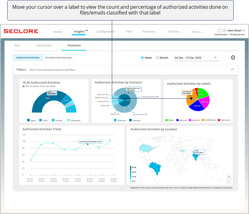
*If you see too many activities done on files/emails with high sensitivity labels, it could prompt you to investigate if activities are being done with a malicious intent.
![]()
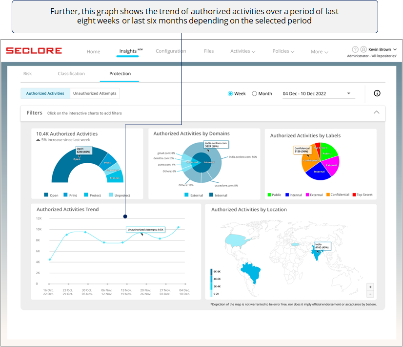
*A sudden spike in a week/month could prompt you to check events that happened during that time.
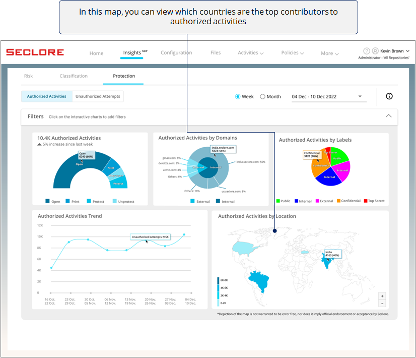
![]()
Finally, if you're an organization with offices across the globe, this heat map can be very useful for you.
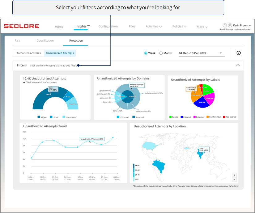
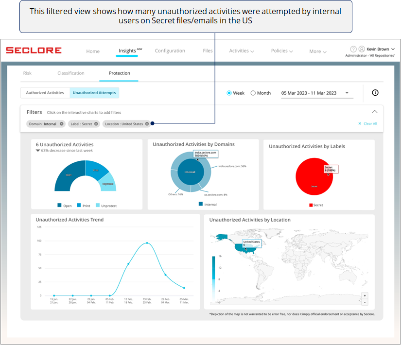
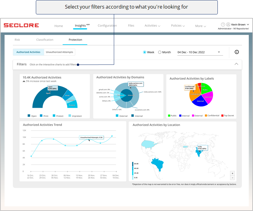
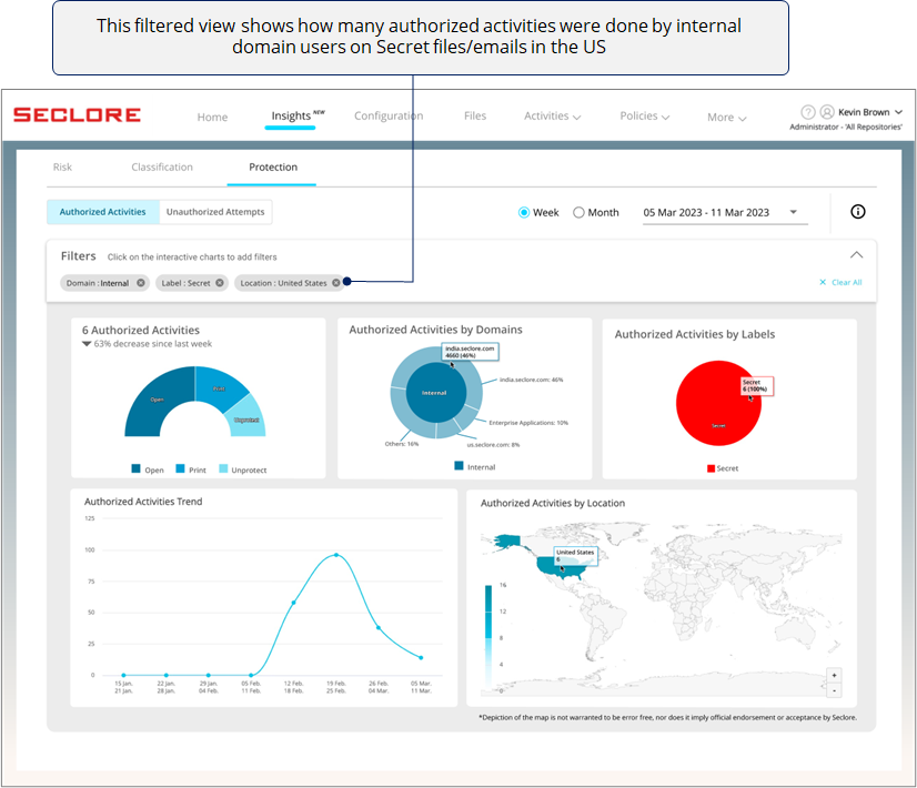
Filter View
- You can use filters to view the charts in a particular context.
- Clicking on a chart component adds that component as a filter.
- Here's how a filtered view would look.
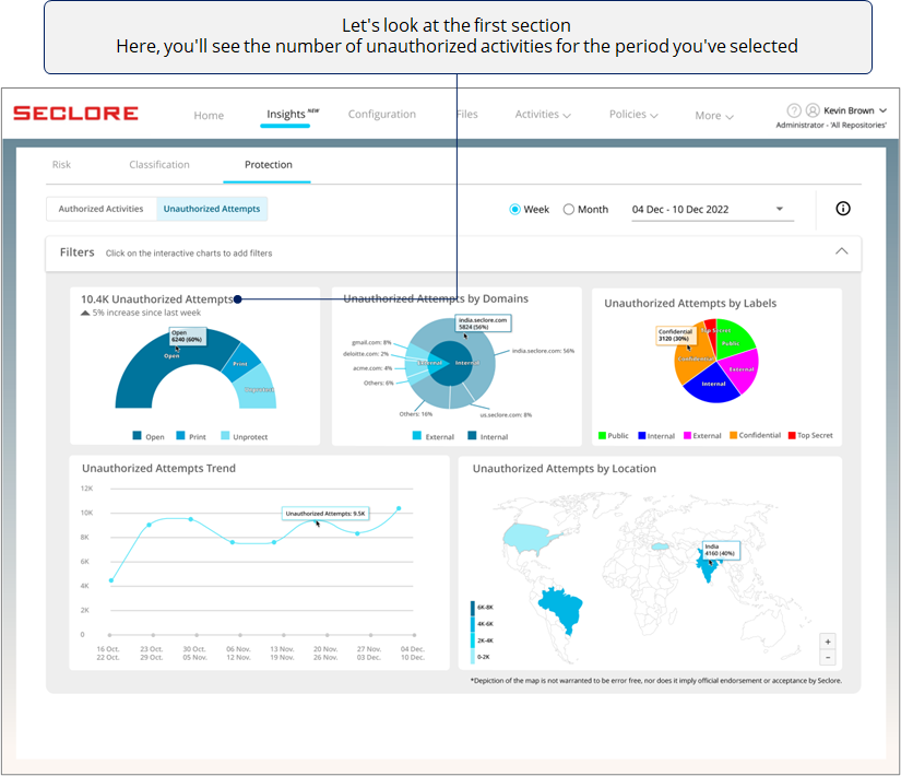
In the Unauthorized Attempts section, you'll get useful charts and graphs related to Open, Print, and Unprotect activities attempted by unauthorized users on protected files/emails.
![]()
![]()
![]()
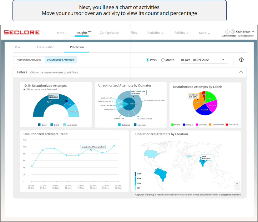
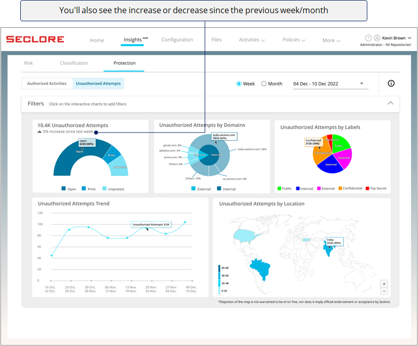
Too many unauthorized activity attempts could prompt you to investigate if files/emails are being shared with unauthorized users with malicious intent.
![]()
The next chart helps you understand which domains are attempting most of the unauthorized activities.
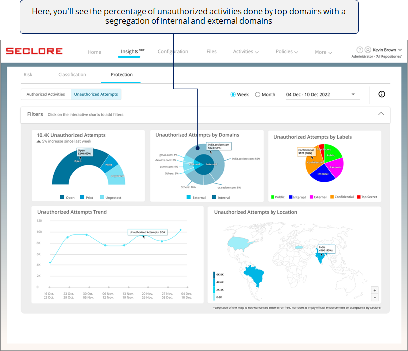
Too many unauthorized attempts done by users of one external domain could mean that protected files/emails may have been shared with those users with malicious intent (although these attempts were blocked by Seclore). Similarly, you can use this chart to identify other anomalies.
*Domain used by users from your organization are considered internal domain, whereas any other domain is considered external.
![]()
Next, there's a pie chart with slices that represent the percentage of unauthorized activities attempted on classified files/emails with different classification labels.
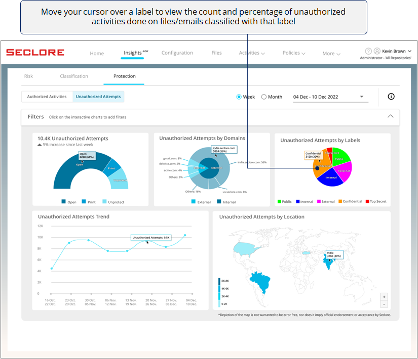
*If you see too many activities done on files/emails with high sensitivity labels, it could prompt you to investigate if activities are being done with a malicious intent.
![]()
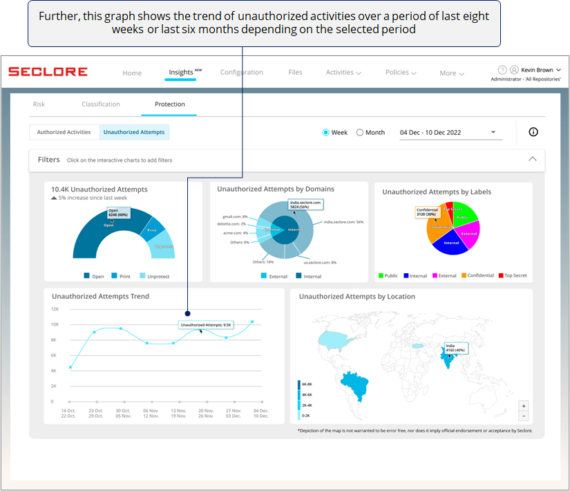
*A sudden spike in a week/month could prompt you to check events that happened during that time - perhaps you ended your partnership with a vendor but they still have your files.
![]()
Finally, if you're an organization with offices across the globe, this heat map can be very useful for you.
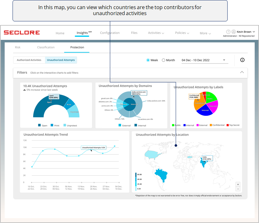
*The heat map could prompt you to contact the regional heads and let them know about the volume of unauthorized activities in their region.
Filter View
- You can use filters to view the charts in a particular context.
- Clicking on a chart component adds that component as a filter.
- Here's how a filtered view would look.