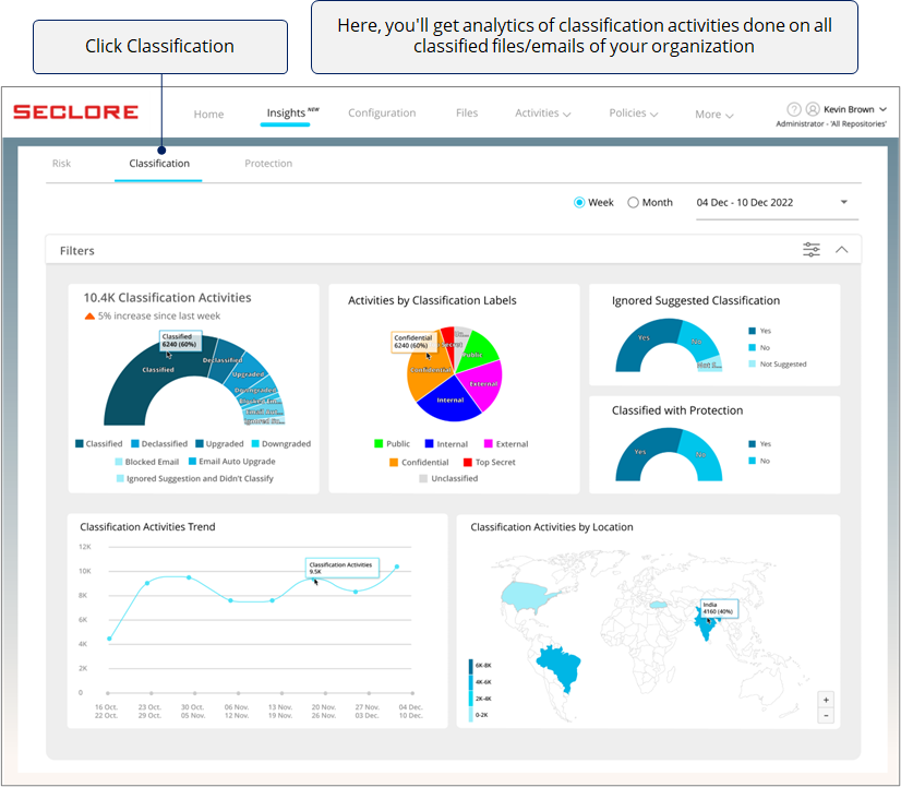
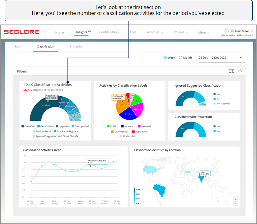
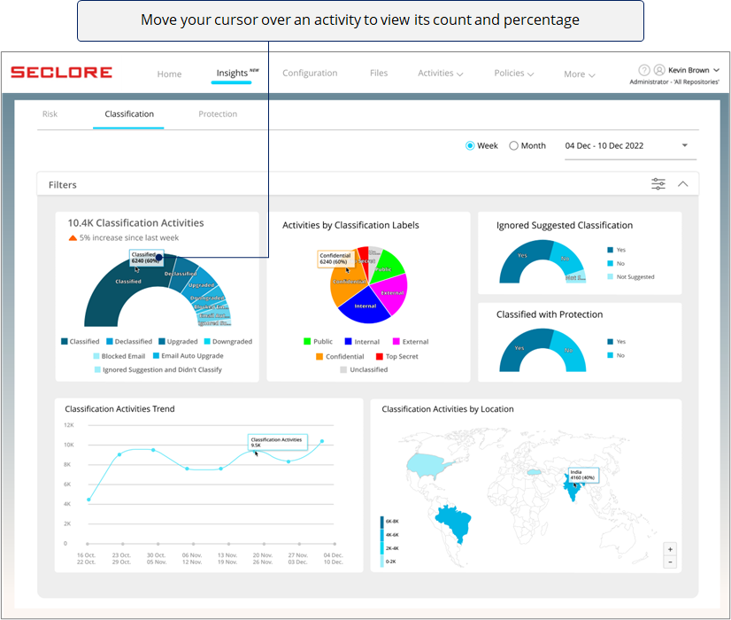
Classification Analytics
In this section, you can explore analytics related to classification activities such as classifying, declassifying, upgrading/downgrading classification, etc. You can click on components of the different charts and create filters to view data in a particular context.
These charts will help you identify patterns and anomalies for classification activities done in your organization.
Step-by-step
![]()
![]()
![]()
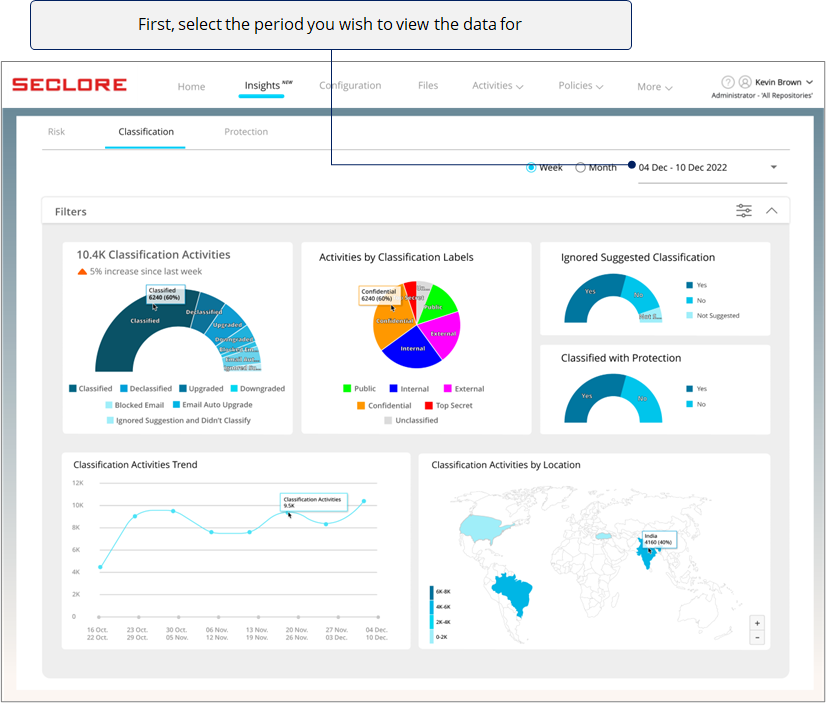
*Note that selecting 'Last Week' would show data from Sunday to Monday in the previous week.
![]()
![]()
![]()
Now let's understand what these activities mean.
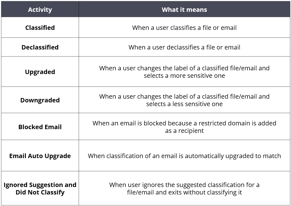
Next, there's a pie chart with slices that represent the percentage of classification activities done on files/emails with different classification labels. Here, the labels are the ones that were present in the files/emails after an activity was done.
*This chart will help understand which labels are being used the most.
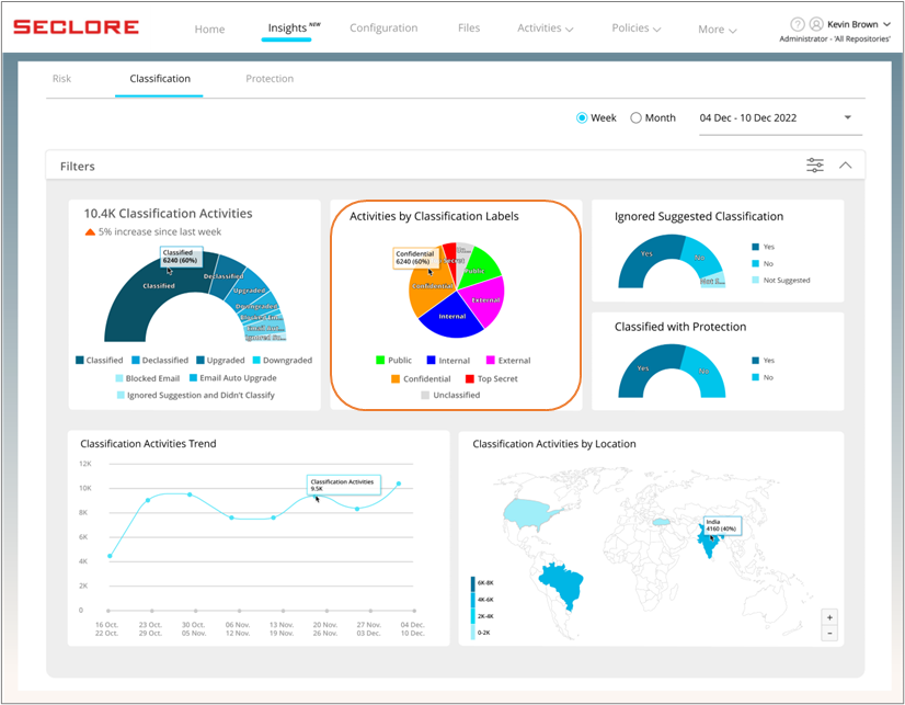
In this section, you can view the count and percentage of users who have or haven't ignored the classification labels suggested by the organization.
*If you see a significant number of users have ignored the suggested classification, it could prompt you to check whether correct content policies have been set by the administrator.
Click here to learn how to create a content policy>>
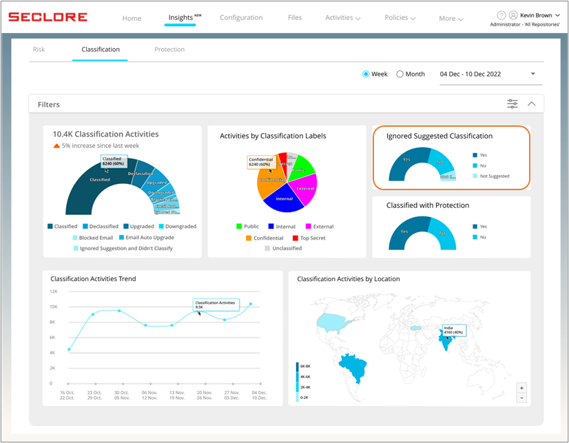
Next, in this chart you can view the count and percentage of files and emails that were protected based on the selected classification label.
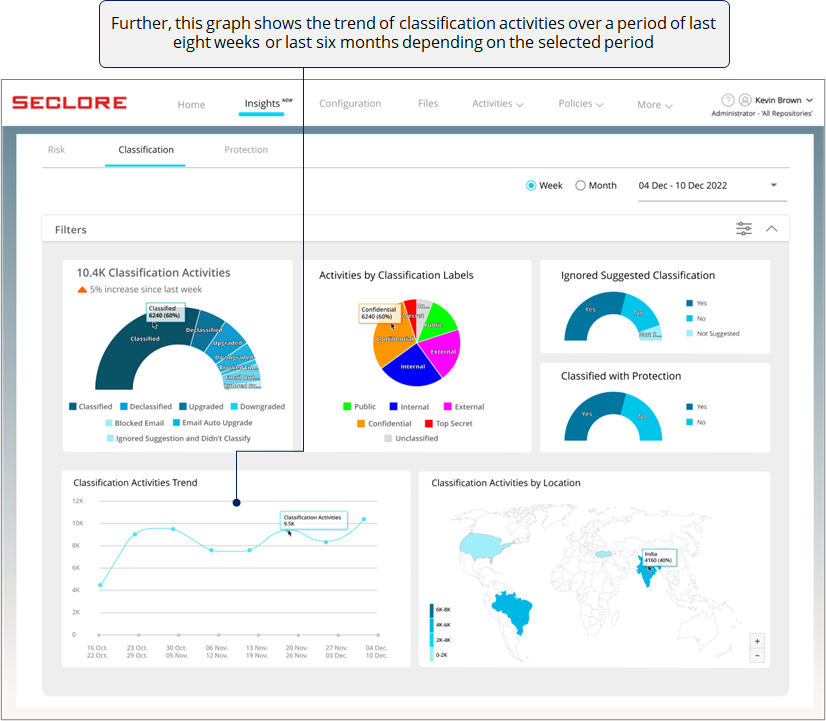
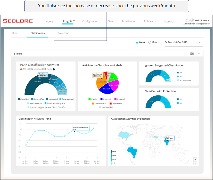
*A sudden dip could prompt you to check why classification activities dropped for a particular period.
Finally, if you're an organization with offices across the globe, this heat map can be very useful for you.
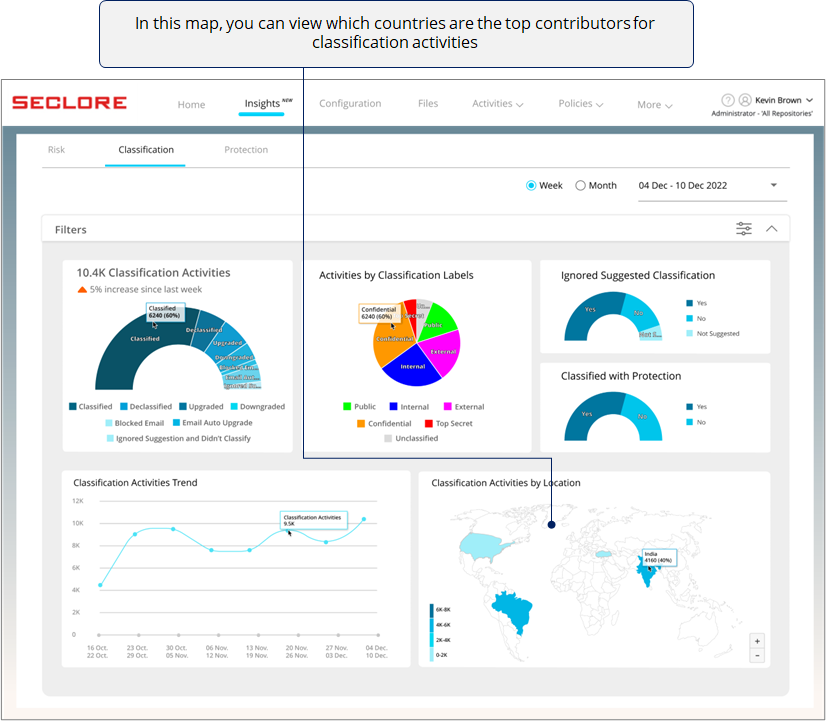
*If you notice low volume of classification activities in a region, it could prompt you to check why users in that region are not using the classification feature the way they should.
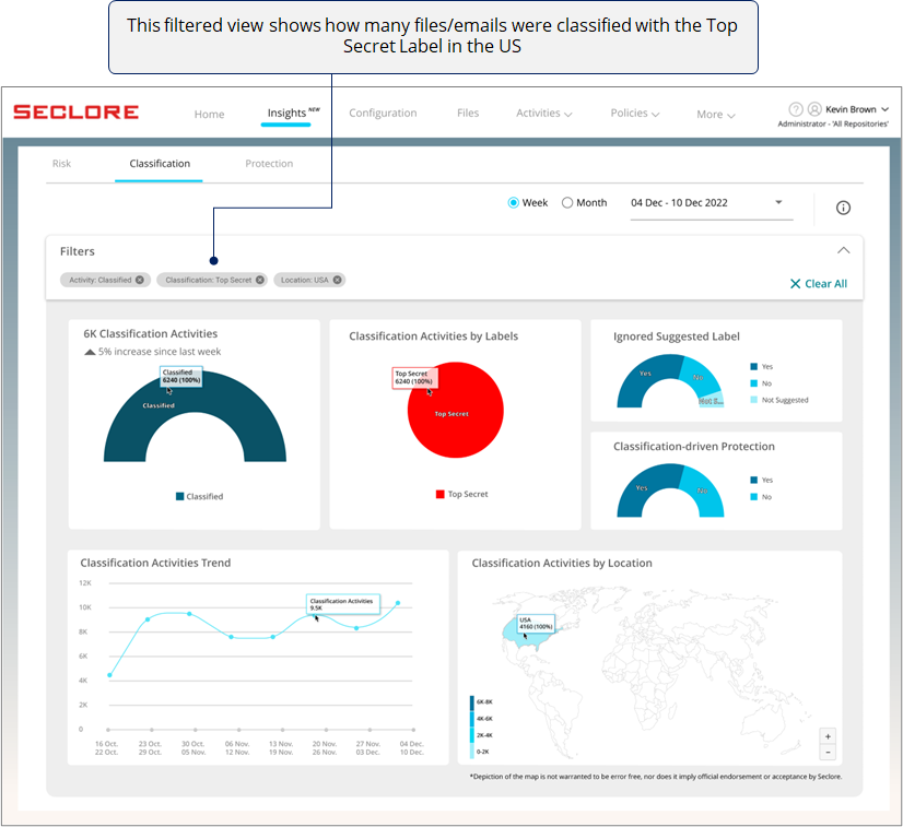
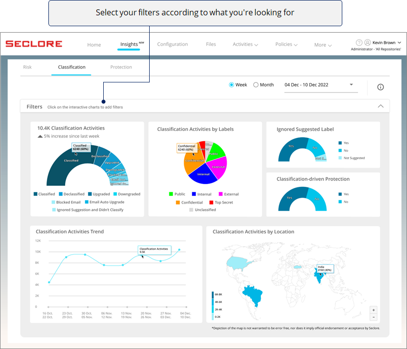
Filter View
- You can use filters to view the charts in a particular context.
- Clicking on a chart component adds that component as a filter.
- Here's how a filtered view would look.